Pandia Health On-boarding Redesign
Ensuring an in-control and clear sign-up experience
Overview
Pandia Health is a start-up that provides an easier way to get birth control. They deliver birth control for free and also offer online prescriptions for birth control. We were brought onto the project to find a means to increase the number of conversions for people who enter the site starting with the sign-up process.
Team & Duration
I worked closely with 2 other UX designers during this 3 week design sprint. We were all equal contributors throughout the sprint.
Teammates:
Patrick Khachi - www.patrickkhachi.com
Janet Lee - www.janetlee.design
Tools & Methods
Digital prototype
User interviews
User Journey map
Empathy map
Contextual inquiry
User Testing
User Archetype
Competitive and comparative analysis
Wireframing
Understanding the Users
Our team did 8 contextual user interviews. We took quotes/ideas/topics from each interview and affinity mapped them to figure out key insights on what Pandia Health’s users had to say about the overall sign-up process. In the end, we discovered that our users were abandoning the sign-up process due to the following 4 insights:
I need clarification
I want it to be accurate because it’s important
I’m in a rush
I want my info to be safe
Alignment of User Needs and Business Needs
The meeting point between the business needs and user needs revolves around trust. The business wants to be trusted and the user wants a reason to trust Pandia Health. Our solution moving forward will revolve around this.
The Problem
“Why am I finding out about this now?”
“It’s kind of confusing. It was really wordy. It wasn’t very clear”
Pandia Health’s biggest challenge is informing users of what to expect before they begin the process and how to address questions before they arise.
The Solution
The primary user goals our solution supports are ensuring that people feel prepared and in control of their experience.
Journey Map
We focused on the the areas where users felt the most frustrated in the process (marked by the red arrows).
Original Design + Redesign of Delivered Solution
Progress Bar
The universal progress bar is designed to convey progression and allow users to feel less anxious and frustrated because they’ll be able to anticipate their completion.
Our Redesign
Current Design
Redesigned Progress Bar
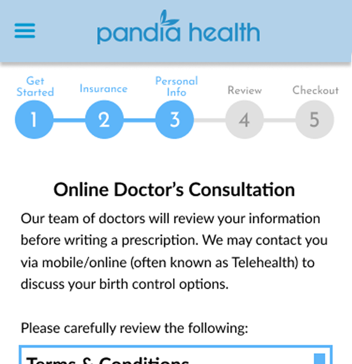
After conducting some comparative and competitive analysis, we designed the progress bar so there is text to clearly indicate exactly what sections the user is completing and the numbers indicate the total number of steps in the process. The change of colors also gives the user another way to see what sections they have completed showing them progression and giving them clarity of the overall process.
Overview Pages
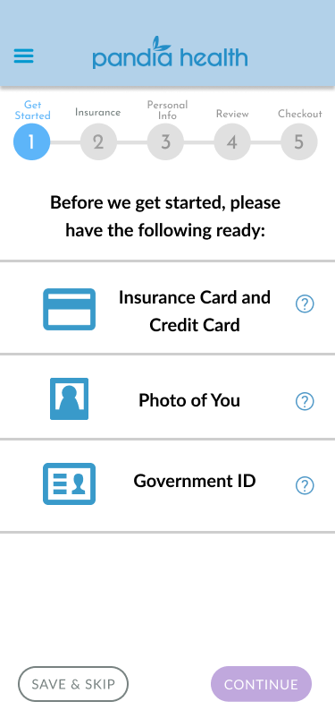
Another element we considered was overview pages. These series of pages lets the user know what information is going to be asked as they proceed through the sign-up process. Making sure they feel prepared and that they understand the expectations they’ll be asked throughout the form and not just the beginning.
Our Redesign
Save & Skip
Added Feature
The save & skip button gives users a chance to return to the section when they are more prepared. Through the user interviews many did not have all of their information on hand. This feature allows users to exit the flow and sign back in when they are ready.
Confirmation & Affirmation
Added Feature
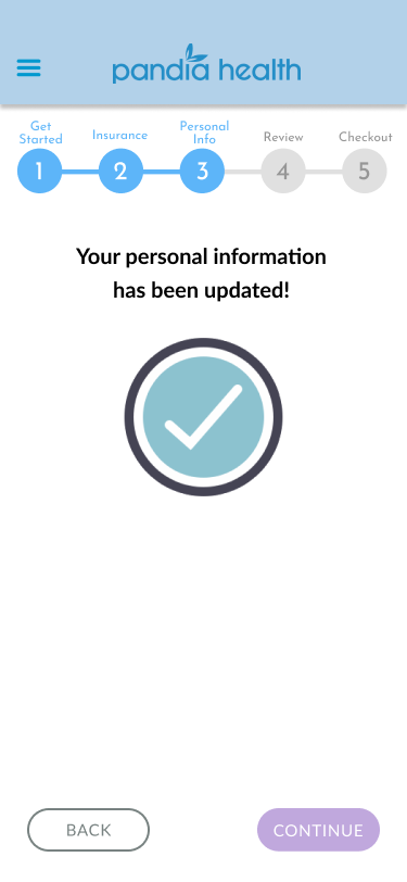
Through testing, we found that users didn’t necessarily know if they were answering the questions correctly, so we made confirmation screens at the end of each section to give them positive reinforcement that they are completing the form successfully. This promotes a positive experience by giving them reassurance.
Prototype
This prototype shows one phase of the Pandia Health online registration process. It shows a user registering and includes five new features:
A progress bar
A back button
A “save & skip” button
Overview page
Validation/direct feedback


