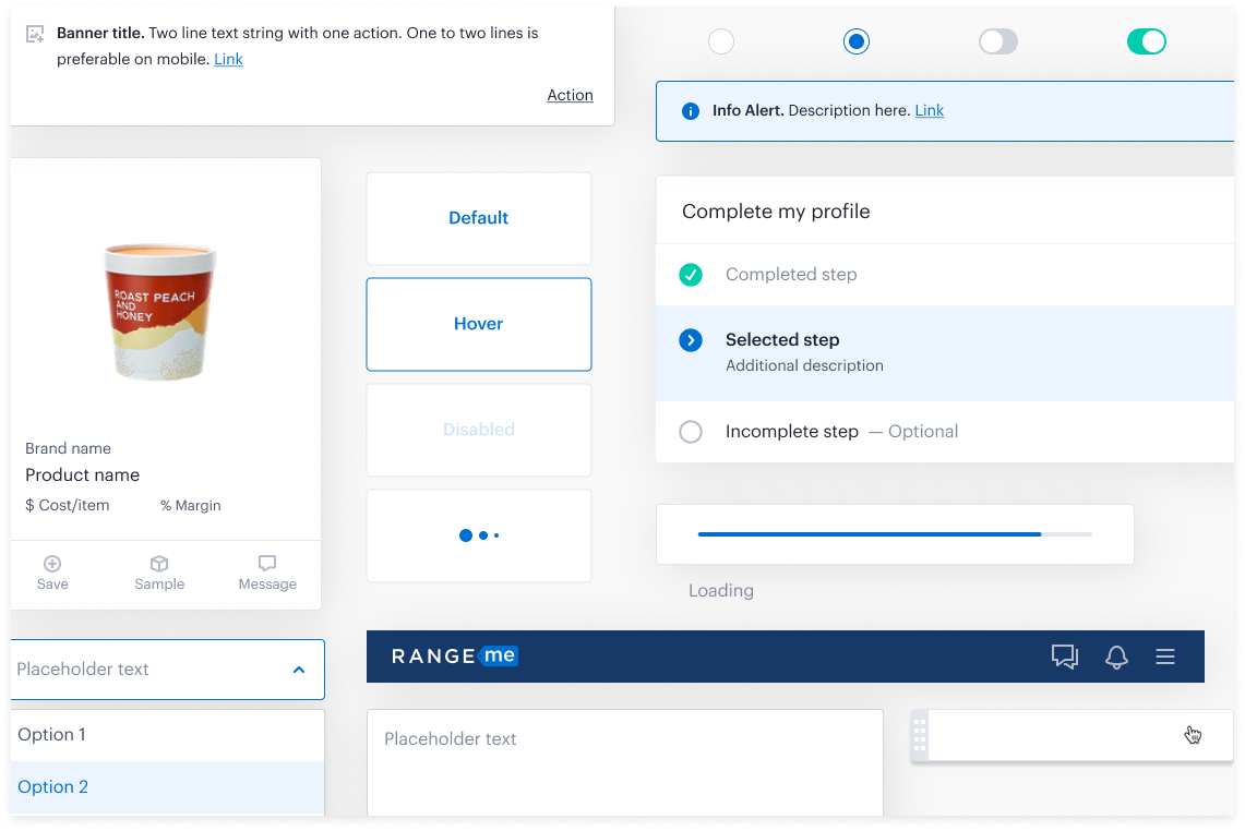
RangeMe Design System
An entire design system refresh to align with RangeMe’s 5 core design principles.
Designed 5 libraries and 700+ components
My role
I led a team of 3 designers to reorganize/redesign a design system from the ground up using Figma’s auto layout and variants functions.
Tools
Figma | Illustrator
Duration
4 months
Benefits
Improve design and engineering handoff
Help designers quickly find the right components
Improve consistency between designs
Make responsive designs quicker to implement
Speed up hi-fi design process
Costs
Reduce bandwidth for core projects
Initially slow down implementation due to unfamiliarity with Figma’s new component/variant tool
Create design debt
After analyzing the costs and benefits of this project I realized that the benefits definitely out weighs the costs. Knowing this, I was able to create a presentation highlighting the current problems and why revamping our current design system would be a huge benefit to the business.
What we improved
Detailed Descriptions and Links to Documentation
Components have more detailed descriptions about when and why they are used. Additionally, links to view developer documentation were added to improve the engineer’s experience.
Breaking Down Complex Components & Creating Variants
Components are structured in a way where elements can be customized and dynamic. This improves the consistency of the design library as complex interfaces can be composed of simpler building blocks without needing to be built from scratch.
Making Components Responsive
Elements within components dynamically respond to resizing instead of being distorted or misplaced allowing designers to quickly iterate and prototype new ideas.
Next steps
Build out the mobile component library
Keep library components and elements up-to-date
Improve documentation of spacing and padding requirements to help devs implement designs


