JUMP’s Appropriate Bike Parking Locator
Maintaining JUMP’s dockless bike stations by eliminating out-of-place bike parking
Overview
Jump gives bike riders the convenience of dockless bike stations, but needed to explore how to help users park responsibly.
Team & Duration
I worked closely with 2 other UX designers during this 2 week design sprint. We were all equal contributors throughout the sprint.
Tools & Methods
Digital prototype
User interviews
User Journey map
Contextual inquiry
User Testing
User Archetype
Competitive and comparative analysis
Wireframing
Problem Statement
“I just left it in an alleyway.”
One of the biggest challenges for JUMP riders is knowing where to park their bike when they get to their destination. Many who are in a rush to get to their destination on time now are stressed and uncertain of where to lock their bike, especially because they may be fined for a mistake. There is no clear information on the app or bike that helps them find a suitable parking location.
A key attraction of their business of dockless bikes should be a convenience since they can be left anywhere. However, when there is a lack of guidance of where to park “responsibly” bikes are left against buildings or in the way of traffic, reducing JUMP’s dream of enhanced city mobility to a pile of unwanted bikes littered everywhere in the city.
Solution Overview
Clearly indicating bike parking options helps users park responsibly.
An added flow that clearly gives parking options will eliminate the ambiguity and prevent users from guessing based on what they feel is “out of the way” or “responsible”. We believe that an added help feature that locates parking options closest to their location will help users feel less stressed throughout their commute from start to finish and even afterwards. This will leave riders feeling assured that they don’t have to worry about future fines and letting them know that the next rider will have ease using the bike as well.
Progress Description
Finding our target users
We started the early parts of the project through a screener survey to narrow down who the main target audience is for JUMP. By focusing on the key riders, this helped us understand their user journey, how they use the product, and their main pain points throughout the whole process.
Brainstorming solutions through competitive and comparative analysis
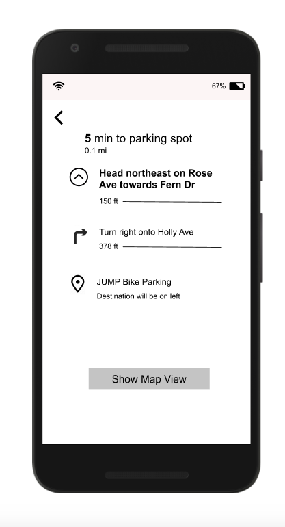
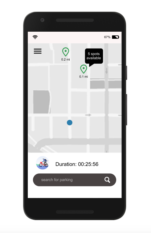
After rapidly brainstorming solutions to these problems, we combined certain futures together that really helped our users understand what is responsible parking and how to find alternative options. For example, a GPS locator would be added to show their current location and multiple parking options close by, with directions telling them how to get to the desired location (like in Google maps).
Sketch, ideate, and prioritize
After brainstorming our solutions, we sketched them down into a paper prototype, which we then conducted multiple user testings. After testing with several users we made some changes and then designed a cleaned up version on Figma, which then turned into a clickable prototype.
Design Deliverables + Overview Of Delivered Solution
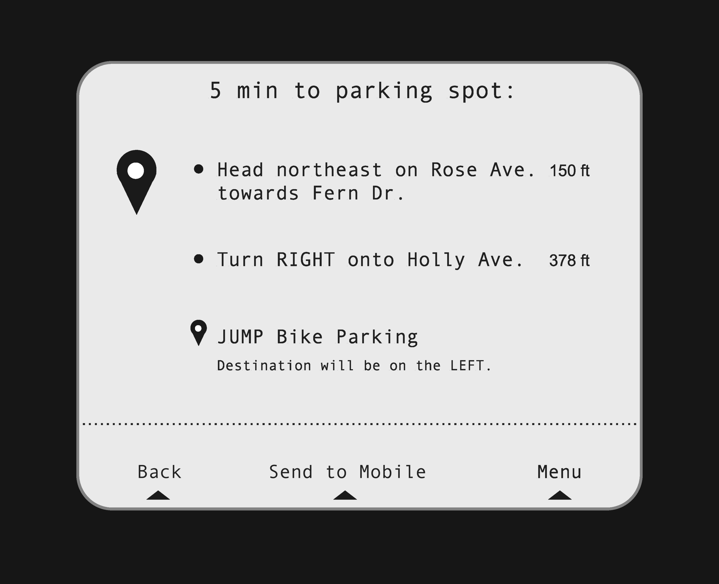
Our solution will be implemented in the bike reservation screen, where users can automatically check if they parked correctly or need to make adjustments in finding a correct location.
Next Steps
We want to create the same experience on mobile as well, especially with the new release of phone holders on all JUMP bikes.
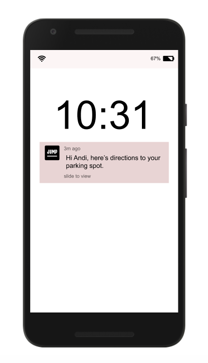
“send to mobile” button will be added to give riders another way to use phone as a navigation/GPS device.
Mobile screens that will be created to provide riders same experience on their phone as designed for the bike screen.
Results & Reflections
Overall, I had an amazing experience working on this project — Not only did I have a supportive team that challenged me and pushed me to always ask why, I learned so much from interviewing our JUMP’s users. I managed to really understand their journey and the emotions they felt throughout the whole process. Being in their shoes allowed my team and I to come up with solutions that are narrowed down to solve the problem. Avoiding solving issues that did not align with the business and user goals. I am proud of the solutions my teammates and I came up with. We strongly believe in JUMP’s vision of utilizing dockless stations for it’s huge potential for social and environmental impact.
The part of the process that I really look forward to is the next steps. After our presentation, we had a lot of constructive feedback and questions to consider. Our solution was only solved through the screen on the bike. We can further our vision by expanding to mobile. Creating a mobile option gives our user another way to look for help. Especially since JUMP just brought out a new mobile stand in all of their bikes. Allowing user to have their phone readily available when on their commute. I’m excited to continue developing an new and improved mobile option for finding parking options.


